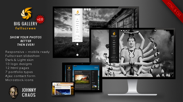
“BIG Gallery - Website Template” Documentation by “Jan Skwara (johnnychaos)” v1.0
“BIG Gallery - Website Template”
Created: 20/07/2012
By: Jan Skwara (johnnychaos)
Email: jan.skwara@germino.pl
Table of Contents
- Getting started
- Adding logo
- Creating menu
- Photo Gallery
- Video Background
- Sound
- Creating new pages
- Typography
- Ajax Contact Form
- Configuration & Plugins
- PSD files
- Resources
- Customization
A) Getting started - top
BIG Gallery is an unique way to present your photos, images or projects. It's like Flash website without Flash! It allows you to present your work as big as possible.
You can find few fullscreen templates, but if you're a photographer, you know how important is composition. Fullscreen photos are always cutted or stretched, so they don't look as you wanted.
BIG Gallery allows you to choose from 4 ways of fullscreen slideshow. You can fill all screen with the image, fill full width or height. You can also automaticly adjust images to prevent them from being cut. You can change slideshow type separately for every page.
Take a look at the example:
Filled image (cutted on the top and bottom):

Uncut image (all visible):

You can add a description to every photo:

You can also create classic gallery with thumbnails:

There is also a slideshow gallery:

Check it yourself (you can play with browser size - slideshows are fully responsive):
- Filled - all screen is filled with image
- Uncut - all image is visible
- Full width - all images are resized to have browser width
- Full height - all images are resized to have browser height
- Classic gallery
- Slideshow gallery
BIG Gallery has another unique feature. Logo, menu and other elements are autohiding after few seconds if you don't move the mouse (this can be set with config file). So now you can see only photos! If you move the mouse, navigation will show up. Open live preview and wait for 2 seconds (do not move the mouse).
Features:
- Fill, uncut, full width or full height fullscreen slideshow (set it separately for home page and other pages)
- Autoplay slideshow
- Full screen video background (you can use self hosted MP4 file, Youtube or Vimeo)
- Auto-hide navigation
- 2 Skins: Dark and Light
- 10 logo designs, each with dark and light version (PSD)
- 20 HTML pages
- 8 portfolio types (fullscreen, slideshow, filterable and classic)
- Unique filterable modern blog
- Multilevel menu
- Fancybox
- Working Ajax contact form with real-time validation
- Twitter Integration
- 100 social icons
- 21 stock sites icons to sell your photos better
- Cross-browser compatibility (IE8/9, Firefox, Opera, Safari, Chrome)
- Valid HTML & CSS
- Configuration file for setting options with ease
- All photos included
- Responsive design - mobile and tablet ready
To install theme simply unzip files and copy everything from download/html/your_skin/ to your web server. your_skin means one of website versions: dark or light.
B) Adding logo - top
You can create your own logo or modify one of premade designs. Photoshop files are located in download/psd/.
Save your logo as logo.jpg and copy this file to download/html/your_skin/img/
Free fonts used in logo designs:
- Quicksand - http://www.fontsquirrel.com/fonts/Quicksand
- Scriptina - http://www.fontsquirrel.com/fonts/Scriptina
- Yanone Kaffeesatz - http://www.fontsquirrel.com/fonts/Yanone-Kaffeesatz
- Orator std - http://fonts.zaraf.ro/font3219/Orator-Std-Medium.htm
- Oswald - http://www.fonts2u.com/oswald.font
- Mutlu Ornamental - http://www.dafont.com/mutlu-ornamental.font
C) Creating menu - top
Theme uses multilevel menu based on superfish menu. More informations about this menu you can find here
Here is the initial menu structure:
		<!-- Superfish menu start -->
		<ul class="sf-menu sf-vertical">
			<li>
				<a href="index.html">HOME</a>
			</li>
			<li>
				<a href="video.html">HOME VIDEO</a>
			</li>
			<li>
				<a href="about.html">FEATURES</a>
					<!-- Superfish menu second level start -->
					<ul>
							<li><a href="about.html">with image bg</a></li>
							<li><a href="about-video.html">with video bg</a></li>
						</ul><!-- Superfish menu second level end -->
			</li>
			<li>
				<a href="#">PORTFOLIO</a>
					<!-- Superfish menu second level start -->
					<ul>
							<li><a href="gallery_fw.html">Full width</a></li>
							<li><a href="gallery_fh.html">Full height</a></li>
							<li><a href="gallery_2c.html">2 columns</a></li>
							<li><a href="gallery_3c.html">3 columns</a></li>
							<li><a href="gallery_4c.html">4 columns</a></li>
							<li><a href="#">Third level</a>
								<!-- Superfish menu third level start -->
								<ul>
									<li><a href="#">Sample link</a></li>
									<li><a href="#">Sample link</a></li>
								</ul><!-- Superfish menu third level end -->
							</li>
					</ul><!-- Superfish menu second level end -->
			</li>
			<li>
				<a href="modernblog.html">BLOG</a>
					<!-- Superfish menu second level start -->
					<ul>
							<li><a href="modernblog.html">Modern blog</a></li>
							<li><a href="blog.html">Classic blog</a></li>
							<li><a href="modernblogpost.html">Blog post</a></li>
					</ul><!-- Superfish menu second level end -->
			</li>
			<li>
				<a href="contact.html">CONTACT</a>
			</li>
			<li>
				<a href="../dark/index.html">DARK SKIN</a>
			</li>
		</ul><!-- Superfish menu end -->
Menu is based on unordered list. Nest lists to make multilevel menu.
Below superfish menu you can find social and stock icons. Social icons are located in download/html/your_skin/img/icons/social (100 icons). Stock sites icons are located in download/html/your_skin/img/icons/stock (21 icons).
D) Photo Gallery - top
With BIG Gallery you can choose classic, slidshow or fullscreen gallery.
Classic gallery

Classic gallery uses fancybox plugin to present big photos:

You can choose 3 types of thumbnails: 2, 3 or 4 columns. Thumbnails photos are located in download/html/your_skin/gallery/2c, download/html/your_skin/gallery/3c and download/html/your_skin/gallery/4c. Biggest thumbnails are 295 px width, medium: 180 px, and smallest: 122 px.
Insert image using this commend:
	<li class="">
			<!-- Gallery item with fancybox and caption -->
			<div class="item">
				<img src="...path_to_thumbnail_photo..." alt=""/>
				<a class="gallery_group" rel="gallery_group" href="...path_to_big_photo..." title="Photo description goes here">
				</a>
				<div class="details">
					<div class="mblogfooter2 custom_font"><p>Photo title goes here</p></div>
				</div>
			</div>
		</li>
If you want to present photos as a gallery (navigation buttons on the big photo) add class and rel with value gallery_group to the <a> tag (as in the example above). If you want to present item as a single photo add class="fancybox" to the <a> tag. Value of title will be used as a photo description.
If you want to make gallery filterable (see live demo), please reffer to Configuration & Plugins section.
Fullscreen gallery
Fullscreen gallery (full width)
Fullscreen gallery (full height)

Photo description
You can choose from 4 fullscreen gallery types:
- Filled - all screen is filled with image
- Uncut - all image is visible
- Full width - all images are resized to have browser width
- Full height - all images are resized to have browser height
To set one of above types to gallery you need to have following line in head section of html file:
<script type="text/javascript">var slideSize='height';</script>
slideSize can have one of following values: fill, uncut, heigh, width
Type of slider for Home Page you can set with config file. Please reffer Configuration section.
Creaing fullscreen gallery
Prepare images and copy them to download/html/your_skin/gallery/full/
Please use photos at least 1600px long and 1000px tall for full width gallery. For full height gallery keep your photos at least 1000px in height, to avoid pixelation. If you have many photos don't save them in high quality to avoid long website loading (preview photos are about 200-300 KB each).
Prepare thumbnails and copy them to download/html/gallery/your_skin/gallery/mini/
Thumbnails size should be 100px x 100px.
To edit images in the template open html file in text editor (note: do not use MS Word or OpenOffice to edit files, use notepad or dedicated editor instead). Gallery items looks like this:
!-- Fullscreen gallery start -->
<div class="slider" id="slider">
	<div id="gallery">
		<!-- Photos go here -->
		<img src="img/blank.png" data-original="gallery/full/1.jpg" width="1600" height="1008" alt=""/> <-- this is a photo
		<img src="img/blank.png" data-original="gallery/full/2.jpg" width="1600" height="1063" alt=""/>
		<img src="img/blank.png" data-original="gallery/full/3.jpg" width="1200" height="800" alt=""/>
		<img src="img/blank.png" data-original="gallery/full/4.jpg" width="1600" height="1063" alt=""/>
		<img src="img/blank.png" data-original="gallery/full/5.jpg" width="1600" height="1345" alt=""/>
		<img src="img/blank.png" data-original="gallery/full/6.jpg" width="1600" height="1064" alt=""/>
		<img src="img/blank.png" data-original="gallery/full/7.jpg" width="1600" height="1066" alt=""/>
		<img src="img/blank.png" data-original="gallery/full/8.jpg" width="1600" height="1067" alt=""/>
		<img src="img/blank.png" data-original="gallery/full/9.jpg" width="1600" height="1051" alt=""/>
		<img src="img/blank.png" data-original="gallery/full/10.jpg" width="1600" height="1067" alt=""/>
	</div>
</div><!-- Slider div end / Fullscreen gallery end -->
As you can see src attribute of each image point to blank.png file, and proper image path is in the data-original property. It's because template uses lazy load feature. Lazy Load delays loading of images in long web pages. Images outside of viewport are not loaded until user scrolls to them. This is opposite of image preloading. Using Lazy Load on long web pages will make the page load faster. In some cases it can also help to reduce server load.
It's important to add proper image width and height in img tag.
Thumbnails looks like this:
	<div id="thumbnails">
		<!-- Thumbnails go here -->
		<a href="#"><img src="img/blank.png" data-original="gallery/mini/1.jpg" alt=""/></a> <-- this is a thumbnail
		<a href="#"><img src="img/blank.png" data-original="gallery/mini/2.jpg" alt=""/></a>
		<a href="#"><img src="img/blank.png" data-original="gallery/mini/3.jpg" alt=""/></a>
		<a href="#"><img src="img/blank.png" data-original="gallery/mini/4.jpg" alt=""/></a>
		<a href="#"><img src="img/blank.png" data-original="gallery/mini/5.jpg" alt=""/></a>
		<a href="#"><img src="img/blank.png" data-original="gallery/mini/6.jpg" alt=""/></a>
		<a href="#"><img src="img/blank.png" data-original="gallery/mini/7.jpg" alt=""/></a>
		<a href="#"><img src="img/blank.png" data-original="gallery/mini/8.jpg" alt=""/></a>
		<a href="#"><img src="img/blank.png" data-original="gallery/mini/9.jpg" alt=""/></a>
		<a href="#"><img src="img/blank.png" data-original="gallery/mini/10.jpg" alt=""/></a>
	</div><!-- thumbnails div end -->
First thumbnail is a link to first photo, second to second etc.
Thumbnails also use lazy load to minify http request during page load. You don't need to add width and height in img tag because all images have the same size (100x100px).
Every photo can have a description. If you add a description it shows up on click, as a modal window. Descriptions are located at desc_cont div. This is a structure.
	<div id="desc_cont">
		<div>Photo description here</div> <-- description for photo 1
		<div>Photo description here</div> <-- description for photo 2
		<div>Photo description here</div> <-- description for photo 3
		<div>Photo description here</div> <-- description for photo 4
		<div>Photo description here</div> <-- description for photo 5
		<div>Photo description here</div> <-- description for photo 6
		...
	</div>
If you don't want to to add description to some photo, just insert an empty div (<div></div>):
	<div id="desc_cont">
		<div>Photo description here</div> <-- description for photo 1
		<div></div> <-- photo 2 don't have a description
		<div></div> <-- photo 3 don't have a description
		<div>Photo description here</div> <-- description for photo 4
		<div></div> <-- photo 5 don't have a description
		<div>Photo description here</div> <-- description for photo 6
		...
	</div>
Slideshow gallery
To create slideshow gallery you need to add this code:
	<div class="responsiveslides-div" style="width:641px; height: 404px;">
		<ul class="rslides">
			<li><img src="gallery/slides/1.jpg" /></li> <-- this is single slideshow image
			<li><img src="gallery/slides/2.jpg" /></li>
			<li><img src="gallery/slides/3.jpg" /></li>
			<li><img src="gallery/slides/4.jpg" /></li>
			<li><img src="gallery/slides/5.jpg" /></li>
			<li><img src="gallery/slides/6.jpg" /></li>
			<li><img src="gallery/slides/7.jpg" /></li>
			<li><img src="gallery/slides/8.jpg" /></li>
			<li><img src="gallery/slides/9.jpg" /></li>
			<li><img src="gallery/slides/10.jpg" /></li>
		</ul>
	</div>
All images should have the same size. Image width for full page is 641px
It's important to add slideshow size in responsiveslides-div div - paste width and height of images in style attribute.
Use gallery_slides.html as a base for your slideshows.
E) Video Background - top
You can add video background to every page. Big Gallery template supports three types of video embedding: self-hosted MP4 file, Youtube and Vimeo.
1. MP4 file
Insert code shown below at the end of your body tag:
<div id="video-pattern"></div>
<!-- video start -->
<div>
<video id="example_video" class="video-js vjs-default-skin" loop preload="none" poster=""  data-setup="{}" width="640" height="264">
    <source src="URL to mp4 file" type='video/mp4' />
    <track kind="captions" src="" srclang="en" label="English" />
  </video></div>
<!-- video end -->
It's important to provide valid original video width and height in video tag. You can use this free application: Any Video Converter to create MP4 file. You can add overlay pattern to hide pixelation to your video and set volume to on/off - please reffer to Configuration
Note: source src should be URL not path.
Note2: use video.html and about-video.html as a base of your video page templates.
2. Youtube
Insert code shown below at the end of your body tag:
<div id="video-pattern"></div>
<!-- video start -->
<div id="player_overlay"></div>
<iframe id="youtubevideo" src="http://www.youtube.com/embed/YOUTUBE_VIDEO_ID?enablejsapi=1&html5=1&autoplay=0&showinfo=0&controls=0&rel=0&loop=1&playlist=YOUTUBE_VIDEO_ID" frameborder="0"></iframe>
<script>
var player;
function onYouTubePlayerAPIReady() {
  // create the global player from the specific iframe (#video)
  player = new YT.Player('youtubevideo', {
    events: {
      'onReady': onPlayerReady
    }
  });
}

function onPlayerReady() {
	var player_width = 560;
	var player_height = 325;
	var pw; var ph;
	if(player_width/player_height>=w_width/(w_height+25))
	{
		$("#youtubevideo").css({'width': player_width*(w_height+25)/player_height + 'px','height': (w_height+25) + 'px'})
		pw = player_width * (w_height+25) / player_height;
		ph = (w_height+25);
	}
	else
	{
		$("#youtubevideo").css({'width': w_width + 'px','height': player_height*w_width/player_width + 'px'})
		pw = w_width;
		ph = player_height * w_width / player_width;
	}
	$("#youtubevideo").css('margin-left',(w_width - pw)/2+'px');
	$("#youtubevideo").css('margin-top', ((w_height) - ph)/2 +'px');
	if( ! soundplayHome ) { player.mute(); }
	player.playVideo();
	window.setTimeout(function() {
		$("#youtubevideo").css('opacity',1);
	},500);
}

// Inject YouTube API script
var tag = document.createElement('script');
tag.src = "http://www.youtube.com/player_api";
var firstScriptTag = document.getElementsByTagName('script')[0];
firstScriptTag.parentNode.insertBefore(tag, firstScriptTag);
</script>

<!-- video end -->
Replace YOUTUBE_VIDEO_ID with Youtube video ID (in two places in the URL). For exapmle in this link https://www.youtube.com/watch?v=dj9z1Kgxboo Youtube video ID is dj9z1Kgxboo
Note: You can add overlay pattern to hide pixelation to your video and set volume to on/off - please reffer to Configuration
Note2: use youtube.html and about-youtube.html as a base of your Youtube video page templates.
p>Note3: Youtube movie WON'T work on your local computer on Internet Explorer. It WILL work when you upload your site to the server.3. Vimeo
Insert code shown below in the head section of your page:
<script src="http://a.vimeocdn.com/js/froogaloop2.min.js"></script>
Insert code shown below at the end of your body tag:
<div id="video-pattern"></div>
<!-- video start -->
<div id="player_overlay2"></div>
<iframe id="vimeovideo" src="http://player.vimeo.com/video/VIMEO_VIDEO_ID?api=1&autoplay=1&loop=1&badge=0&byline=0&title=0&portrait=0" frameborder="0" webkitallowfullscreen mozallowfullscreen allowfullscreen></iframe>
<script>
var iframe = document.getElementById('vimeovideo');
var vimeoplayer = $f(iframe);
</script>
<!-- video end -->
Replace VIMEO_VIDEO_ID with Vimoe video ID. For exapmle in this link http://vimeo.com/106990857 Vimeo video ID is 106990857
Note: You can add overlay pattern to hide pixelation to your video and set volume to on/off - please reffer to Configuration
Note2: use vimeo.html and about-vimeo.html as a base of your Vimeo video page templates.
Note3: Play/pause and sound on/off buttons to control Vimeo movie WON'T work on your local computer. They WILL work when you upload your site to the server.
Important: video files from preview version are NOT included, but you buy find them here:
- In Style by abramovideo
- Memolines by Ilyon
- Mosaic Photo Reveal by yeaboy
- Squares Album by CandyMustache
F) Sound - top
You can add music to every page, by adding music file URL in config file (download/html/your_skin/js/config.js).
	var soundplayHome = true; //music auto play at start on home page. Values: bolean - true or false
	var soundplay = true; //music auto play at start. Values: bolean - true or false
	var sound_mp3 = "http://chart.civ.pl/themes/big_gallery/dark/media/audio/music.mp3"; //url to sound in mp3 format or false to turn music off
Template supports mp3 files. You can use this free application: Fre:ac. You can set initial music volume to on or off by giving var soundplayand var soundplayHome true or false value.
Note: source src should be URL not path.
Note2: music file is included. Ybut if you want use it on your website, you must give credit to the author:  Act Cool ( Roman Holiday ) by Loveshadow is licensed under a Attribution.
You can find more free music here or here.
G) Creating new pages - top
Template has 2 variants of pages: "fullscreen gallery pages" and "text pages".
Fullscreen gallery pages
Use them to present your work as a fullscreen gallery. Examples in template: index.html, gallery_fw.html, gallery_fh.html, vimeo.html, youtube.html and video.html.
Text pages
Use them to create classic gallery, blog, contact and text pages. Examples in template: about.html, about-vimeo.html, about-youtube.html, about-video.html, blog.html, modernblog.html, modernblogpost.html, contact.html, gallery_2c.html, gallery_3c.html and gallery_4c.html.
Page content should be inside page div:
<div id="page">This is a page content (eg. blog, contact form, about page, etc.</div>
Modern blog

BIG Gallery provides unique filterable modern blog (modernblog.html) - live preview. It uses Caption and Filterable plugins. They are described in "Configuration & Plugins" section.
Here is a structure of modern blog:
	Filterable menu:

	<div class="" id="portfolio-filter">
		<span class="" style="">Filter: </span>
		<a href="#all" title="" rel="all" class="custom_font">All</a>
		<a href="#category1" title="" rel="category1" class="">Category 1</a>
		<a href="#category2" title="" rel="category2" class="">Category 2</a>
		<a href="#category3" title="" rel="category3" class="">Category 3</a>
		[...]
	</div>

	Blog posts:

	<ul class="portfolioblog margin_1line" id="portfolio-list">
	first post
		<li class="category2 category3"> < -- post categories
			<div class="blogitem">
				<img src="gallery/blog/1.jpg" alt="Caption Text"/> <-- post thumbnail (width: 180px)
				<a href="modernblogpost.html" title="" class="overlay"> <-- link to full post
				</a>
				<div class="details">
					<div class="mblogtitle"><h5>Lorem ipsum dolor</h5></div> <-- Post title
					<div class="mblogauthor">10/10/2012 by John Smith</div> <-- Post date and author
					<div class="mblogdesc">
						<p>Lorem ipsum dolor sit amet, conse ctetur adipiscing elit. Vestibulum ultrices, nunc in adipiscing conse ctetur. Phasellus porta euismod volutpat. Donec a nibh eros. Nunc vitae pharetra condim entum. </p> <-- post caption
					</div>
				</div>
				<div class="mblogfooter"><a href="modernblogpost.html" class="butt custom_font">read more</a></div>
			</div>
		</li>
	second post
		<li class="category1 category2">
			<div class="blogitem">
				<img src="gallery/blog/2.jpg" alt="Caption Text"/>
				<a href="modernblogpost.html" title="" class="overlay">
				</a>
				<div class="details">
					<div class="mblogtitle"><h5>Lorem ipsum dolor</h5></div>
					<div class="mblogauthor">10/10/2012 by John Smith</div>
					<div class="mblogdesc">
						<p>Lorem ipsum dolor sit amet, conse ctetur adipiscing elit. Vestibulum ultrices, nunc in adipiscing conse ctetur. Phasellus porta euismod volutpat. Donec a nibh eros. Nunc vitae pharetra condim entum. </p>
					</div>
				</div>
				<div class="mblogfooter"><a href="modernblogpost.html" class="butt custom_font">read more</a></div>
			</div>
		</li>
		[...]
	</ul>
H) Typography - top
BIG Gallery has many CSS-styled tags. Please study about.html file to see them. Below I'm going to explain some of them.
Margins
You can easy control vertical margins of your elements. Simply add one of CSS classes to your block element (div, img, p, blockquote, table, ul, ol, headers, etc.).
Here are available classes to control top-margin:
	<p class="margin_1line"> <-- adds 1 line margin (20px)
	<p class="margin_2line"> <-- adds 2 lines margin (40px)
	<p class="margin_3line"> <-- adds 3 lines margin (60px)
	<p class="margin_1_2line"> <-- adds 1/2 line margin (10px)
	<p class="margin_3_2line"> <-- adds 3/2 line margin (30px)
	<p class="margin_5_2line"> <-- adds 5/2 line margin (50px)
Here are available classes to control bottom-margin:
	<p class="margin_bottom_1line"> <-- adds 1 line margin (20px)
	<p class="margin_bottom_2line"> <-- adds 2 lines margin (40px)
	<p class="margin_bottom_3line"> <-- adds 2 lines margin (60px)
	<p class="margin_bottom_1_2line"> <-- adds 1/2 line margin (10px)
	<p class="margin_bottom_3_2line"> <-- adds 3/2 line margin (30px)
	<p class="margin_bottom_5_2line"> <-- adds 5/2 line margin (50px)
Milticolums
You can split page to two, three or four columns. Use premade divs as shown below. Remember that columns have to be inside container div: <div class="column_cont">colums</div>.
Two columns:

	<div class="column_cont">
		<div class="one-half">
			column content width: 315px.
		</div>
		<div class="one-half">
			column content width: 315px.
		</div>
	</div>
Three columns:

	<div class="column_cont">
		<div class="one-third">
			column content width: 200px.
		</div>
		<div class="one-third">
			column content width: 200px.
		</div>
		<div class="one-third">
			column content width: 200px.
		</div>
	</div>
Two columns (one 1/3 width and second 2/3 width):

	<div class="column_cont">
		<div class="one-third">
			column content width: 200px.
		</div>
		<div class="two-third">
			column content width: 430px.
		</div>
	</div>
Four columns:

	<div class="column_cont">
		<div class="one-fourth">
			column content width: 142px.
		</div>
		<div class="one-fourth">
			column content width: 142px.
		</div>
		<div class="one-fourth">
			column content width: 142px.
		</div>
		<div class="one-fourth">
			column content width: 142px.
		</div>
	</div>
Two columns (one 1/4 width and second 3/4 width):

	<div class="column_cont">
		<div class="one-fourth">
			column content width: 142px.
		</div>
		<div class="three-fourth">
			column content width: 489px.
		</div>
	</div>
Fonts
BIG Gallery uses Tachoma for text and Oswald font for headers and menu (H1, H2, etc.). Oswald font is included using Google fonts. To change this font, follow instructions on "google fonts" website. Insert new font in the CSS file: download/html/your_skin/css/css.css:
h1, h2, h3, h4, h5, h6, .sf-menu a, .read_more, #autoplay, #autoplay a, .custom_font, .custom_font * {
 font-family: 'Oswald', arial, serif; <-- insert new font here
 text-shadow: 3px 3px 3px #000;
}
and include new font in head section on every html page:
<link href='http://fonts.googleapis.com/css?family=Oswald' rel='stylesheet' type='text/css'/>
If you want to add custom font to any element simply add to it class=custom_font"
I) Ajax Contact Form - top

Theme comes with the working Ajax Contact Form with real-time validation. To make it work you only need to edit one line (line #3) in file download/html/your_skin/php/validate.php and insert your e-mail.
define('YOUR_EMAIL','john@doe.tld');
If you don't want to use this script, delete following line from your html files (located at the end of head section):
<script type="text/javascript" src="js/validate.js"></script>
J) Configuration & Plugins - top
Configuration file
BIG Gallery have a configuration file, where you can set some options. File is located in: download/html/your_skin/js/config.js. Here is the content of a file:
var slideSizeHome = 'fill'; //Size of a photo on front page: Values: 'fill' - fill all browser width, 'uncut' - prevent images from beeing cut, 'width' - browser widht, 'height' - browser height, integer eg. 500 - height in px.
var slideSize = 'uncut'; //Size of a photo: Values: 'fill' - fill all browser width, 'uncut' - prevent images from beeing cut, 'width' - browser widht, 'height' - browser height, integer eg. 500 - height in px.
var autoplayHome = true; //autoplay on start on fornt page. Values: bolean - true or false
var autoplay = true; //autoplay on start. Values: bolean - true or false
var autoplaySpeed = 5000; //speed of main slideshow autoplay in miliseconds
var logoHide = 2; //hide logo, menu, arrows after number of seconds with no mouse move. Set 0 for disabling it. Using only with fullscreen gallery pages.
var twitterUsr = 'envato' //insert your twitter username
var videopattern = true; //Shows overlay pattern. Values: bolean - true or false
var imgpattern = true; //Shows overlay pattern. Values: bolean - true or false
var soundplayHome = true; //music auto play at start on home page. Values: bolean - true or false
var soundplay = true; //music auto play at start. Values: bolean - true or false
var sound_mp3 = "http://chart.civ.pl/themes/big_gallery/dark/media/audio/music.mp3"; //url to sound in mp3 format or false to turn music off
var menuShown = 0; //if set to true then menu is shown all the time or autohiding. Values: 0 - Autohide on fullscreen slideshow/video pages, shown on text pages; 1 - Shown on all pages; 2 - Autohide on all pages
As you see, you can set slide size and autoplay separately for home page and other pages. Home page should have this line in it's head section:
<!-- Set this page as home page -->
<script type="text/javascript">var homePage = true;</script>
Plugins
BIG Gallery provides few cool plugins to extend your website. All plugins are styled to look great with dark and light skin.
Tweetie - link

Allows you to show recent tweets on the page.
New Twitter API 1.1 requires oAuth Token Key, here is how to configure plugin:
Go to https://apps.twitter.com and login oir register.
Choose "Create New Spp" like in screenshot below:

Fill aplication name, description and URL. As this application will be only for your use, you can put anything there.

When aplication will be created go to "API Keys" tab.

Copy API key, API secret, Access token, Access token secret and paste it into download/html/your_skin/js/config-twitter.php
    // Api Key
    define('CONSUMER_KEY', 'API_KEY_HERE');
    define('CONSUMER_SECRET', 'API_SECRET_HERE');

    // User Access Token
    define('ACCESS_TOKEN', 'ACCESS_TOKEN_HERE');
    define('ACCESS_SECRET', 'ACCESS_TOKEN_SECRET_HERE');
Then insert your twitter username in config filedownload/html/your_skin/js/config.js
var twitterUsr = 'envato';
//change envato to your username
To place tweets on your site simply add empty div with id="tweets" wherever you want:
<div id="tweets"></div>
Caption

With "Caption" you can add on-hover caption to any image. Usage:
	<div class="item">
		<img src="gallery/3c/1.jpg" alt=""/>
			<a class="fancybox" rel="" href="gallery/full/1.jpg" title="">
		</a>
		<div class="details">
			<div class="mblogfooter2 custom_font"><p>Photo title</p></div> <-- insert caption here
		</div>
	</div>
qTip - link

Replace classic tooltip with this pretty plugin. Usage:
<a href="#" class="qtip" title="link title">link</a>
Filterable - link
Makes your portfolio filterable. Plugin is used on classic gallery pages and modern blog.
First you need to create menu with filterable categories. Links should have defined href and rel attributes:
	<div class="" id="portfolio-filter">
		<span class="" style="">Filter: </span>
		<a href="#all" title="" rel="all" class="custom_font">All</a>
		<a href="#category1" title="" rel="category1" class="">Category 1</a>
		<a href="#category2" title="" rel="category2" class="">Category 2</a>
		<a href="#category3" title="" rel="category3" class="">Category 3</a>
		[...]
	</div>
Next create an unordered list with your porfolio items. Class of a li tag must be a name of category and be the same as rel attribute in your filerable menu, eg: <li class="category1">.
One portfolio item can be assigned to more then one category. To make this insert more then one class in list element Separate them by space, eg: <li class="category1 category3">.
Here is a simple example:
	<ul id="portfolio-list">
		<li class="category1"><img src="porfolio item" alt=""/></li>
		<li class="category2"><img src="porfolio item" alt=""/></li>
		<li class="category1 category3"><img src="porfolio item" alt=""/></li>
		<li class="category1 category2 category3"><img src="porfolio item" alt=""/></li>
		<li class="category3"><img src="porfolio item" alt=""/></li>
	</ul>
And here is an example with Caption plugin. Taken from gallery_3c.html:
	Menu:

	<div class="submenu" id="portfolio-filter">
		<span class="custom_font" style="padding-right:6px">Filter: </span>
		<a href="#all" title="" rel="all" class="custom_font">All</a>
		<a href="#category1" title="" rel="category1" class="custom_font">Category 1</a>
		<a href="#category2" title="" rel="category2" class="custom_font">Category 2</a>
		<a href="#category3" title="" rel="category3" class="custom_font">Category 3</a>
	</div>

	Portfolio items:

	<ul class="portfolio3c margin_1line" id="portfolio-list">
		<li class="category2 category3">
			<!-- Gallery item with fancybox and caption -->
			<div class="item">
				<img src="gallery/3c/1.jpg" alt=""/>
				<a class="gallery_group" rel="gallery_group" href="gallery/full/1.jpg" title="">
				</a>
				<div class="details">
					<div class="mblogfooter2 custom_font"><p>Photo title</p></div>
				</div>
			</div>
		</li>
		<li class="category1 category2">
			<!-- Gallery item with fancybox and caption -->
			<div class="item">
				<img src="gallery/3c/2.jpg" alt="t"/>
				<a class="gallery_group" rel="gallery_group" href="gallery/full/2.jpg" title="">
				</a>
				<div class="details">
					<div class="mblogfooter2 custom_font"><p>Photo title</p></div>
				</div>
			</div>
		</li>
		<li class="category2">
			<!-- Gallery item with fancybox and caption -->
			<div class="item">
				<img src="gallery/3c/3.jpg" alt=""/>
				<a class="gallery_group" rel="gallery_group" href="gallery/full/3.jpg" title="">
				</a>
				<div class="details">
					<div class="mblogfooter2 custom_font"><p>Photo title</p></div>
				</div>
			</div>
		</li>
		[...]
	</ul>
Lazy Load - link
Lazy Load is delays loading of images in long web pages. Images outside of viewport are not loaded until user scrolls to them. This is opposite of image preloading. Using Lazy Load on long web pages will make the page load faster. In some cases it can also help to reduce server load.
To use lazyload add image in this way:
<img class="lazyload" src="img/blank.png" data-original="PATH OF IMAGE FILE HERE" width="IMAGE WIDTH" height="IMAGE HEIGHT" alt=""/>
Address of the image must be put into data-original attribute. Give lazy loaded images a specific class: lazyload. This way you can easily control which images plugin is binded to. It's also important to add proper image width and height in img tag.
K) PSD files - top
Photoshop files are in download/psd. You can find there 10 logo designs and files that help you edit graphic elements of the website.
L) Resources - top
Here are links to used resources:
- Superfish menu
- CoruFredSel
- Filterable
- SimpleModal
- Fancybox
- qTip
- Timer Plugin
- Tweetie
- jScrollPane
- video.js - Video player
- jPlayer
- TinyNav
- debouncedresize
- responsiveslides
- lazyload
- Social media icons
- Photos:
- Music: Act Cool ( Roman Holiday ) by Loveshadow is licensed under a Attribution.
M) Customization - top
I'm offering installation and customization of this template based on my hourly rate – 30$/hour. Send me an e-mail if you are interested.
Once again thank you for purchasing my template. Enjoy!